
Split-complementary
A split-complementary color combination scheme that includes a main color and the two colors on each side of its complementary (opposite) color on the color wheel. These are the colors that are one hue and two equally spaced from its complement. To avoid fatigue and maintain high contrast, this split-complementary color combination scheme should be used when giving powerpoint presentations, or when using a computer for an extended period of time. Additionally, certain colors should not be mixed, like red and green. Colors that should be used are red/purple and yellow/green.
Combinations using this color scheme:
Use quotations for an exact match and to narrow your search "Summer Punch".
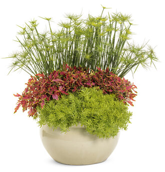
 Part Sun to Shade14"Pot Size
What you'll need:
-
1
-
1
-
2
-
1
-
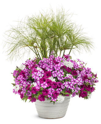
 Sun12"Pot Size
What you'll need:
-
1
-
2
-
2
-